How to structure an Angular frontend: core, shared, pages, and component-driven design
Most Angular projects do not collapse under the framework. They collapse under a question nobody can answer six months in: where does this file go?
When there is no answer, everyone invents one. Components pile up in a components/ folder that grows to two hundred entries. Services land wherever the developer who wrote them happened to be. Business rules leak into templates. Nothing is reusable because nothing is findable.
A folder structure is not decoration. It is a set of enforced answers to that question. Here is the one I use, folder by folder, and the reasoning behind each boundary.
The map
src/
  app/
    core/        app-wide singletons: services, guards, interceptors, config
    shared/      reusable and app-agnostic: ui/, directives/, pipes/, utils/
    layout/      shells that wrap routed pages
    pages/       one folder per route
    content/     copy and data, kept out of components
    state/       cross-cutting reactive state only
  styles/        design tokens, reset, mixins, typography
Seven folders. Each one answers a different question, and the test for whether a file belongs is a question you can answer without opening it.
core/ — things there is exactly one of
core/ holds the singletons. One instance, alive for the life of the app, injected wherever needed. No components ever live here.
core/
  config/        constants that describe the environment
  services/      app-wide services (auth, seo, theme, http clients)
  guards/        route guards
  interceptors/  HTTP interceptors
  enums/         shared enumerations
  constants/     shared constant values
The test: would a second instance of this be a bug? An auth service holding the current session, a theme service owning light and dark mode, an SEO service setting meta tags. Two of any of those is a bug, so they belong in core/.
A few that earn their place in most apps:
A platform service. If you server-side render, half your code needs to know whether it is running in a browser. Scattering isPlatformBrowser(inject(PLATFORM_ID)) across thirty files is how SSR bugs get made. Wrap it once:
@Injectable({ providedIn: 'root' })
export class Platform {
  private readonly platformId = inject(PLATFORM_ID);

  readonly isBrowser = isPlatformBrowser(this.platformId);
  readonly prefersReducedMotion = this.isBrowser
    ? window.matchMedia('(prefers-reduced-motion: reduce)').matches
    : false;
}
Now platform.isBrowser is one import instead of a pattern everyone has to remember.
A config folder. API origins, site metadata, feature flags. Constants, not logic. Keeping them in core/config/ means changing an API host is one file, not a search across the repo.
Guards and interceptors in their own folders. Both are small, both are easy to lose inside services/, and both are the first thing you look for when auth misbehaves.
shared/ — reusable, and ignorant of your app
shared/ is everything that could be lifted into a different project without editing it. That is the whole rule, and it is stricter than it sounds.
shared/
  ui/           presentational components (the big one)
  directives/   behaviour attached to elements
  pipes/        template transformations
  utils/        pure functions
  validators/   reusable form validators
  interfaces/   shared type definitions
The test: does this file know anything about your domain? A button does not know what a case study is. A date pipe does not know your business rules. The moment a shared component imports a domain type, it stopped being shared and belongs in a page.
Directives are underused and belong here. Scroll reveals, parallax, magnetic hover, spotlight effects: each is behaviour that any element might want, attached with one attribute, testable in isolation, and reusable across every page.
shared/ui/ — atomic design, and why the layers help
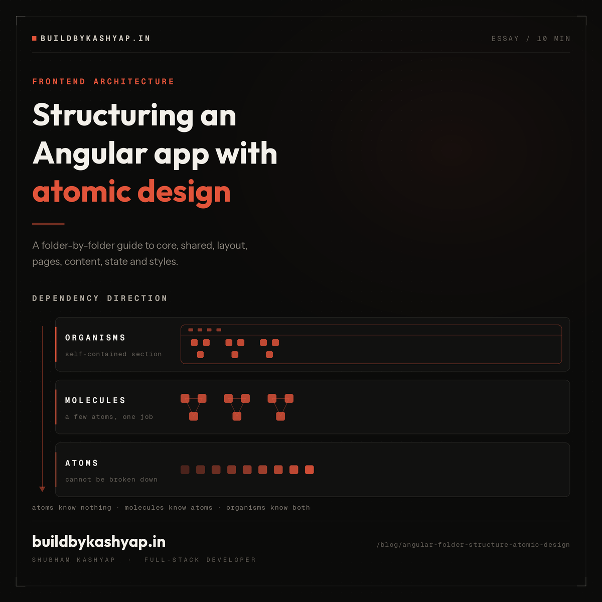
This is where most structures fall apart, because "components" is not a category. Atomic design gives you three, ordered by how much they know.
shared/ui/
  atoms/        cannot be broken down further
  molecules/    a few atoms doing one job
  organisms/    a self-contained section of interface
Atoms are the smallest useful units. A button, an input, a label, a badge, an icon, a heading. They own their appearance and nothing else. An atom never fetches data, never knows a route, and never imports another component from ui/.
Grouping helps once you pass twenty of them:
atoms/
  actions/      button, icon-button, link
  form/         input, label, select, textarea, checkbox, field-error
  display/      badge, tag, avatar, divider, metric
  feedback/     spinner, status-dot, skip-link, scroll-progress
  typography/   heading, text, eyebrow, prose
  media/        image
Molecules combine a few atoms into one job. A form field is a label plus an input plus an error message: three atoms that always travel together. A card is an image plus a heading plus a tag list. Molecules can hold small amounts of presentation logic, but still no data fetching.
Organisms are complete sections. A site header, a footer, a contact form, a mobile nav. They may hold real interaction logic and may talk to a service. This is the layer where an app starts to show through.
The value is not the vocabulary. It is the dependency direction: atoms know nothing, molecules know atoms, organisms know both. Dependencies point one way only. When that holds, you can change a button without auditing the app, because nothing above it reaches back down and grabs its internals.
layout/ — the frame around the page
Layouts are the shells routes render inside. A public shell with header, footer, and mobile nav. An admin shell with its own navigation. An error shell with neither.
layout/
  public-shell/
  admin-layout/
  error-layout/
Keeping these separate from pages/ means the header is defined once, not repeated in every routed component, and a whole surface of the app can be reframed by editing one file.
pages/ — one folder per route
This is the feature layer. In a bigger app you would call it features/, with the same rules.
pages/
  home/
    home.page.ts
    home.page.html
    sections/
      hero-section/
      proof-bar/
      selected-work/
      services-teaser/
      faq-section/
  blog/
    blog-index/
    blog-post/
  work/
    work-index/
    case-study/
Two things make this work.
A page composes, it does not implement. The home page should read as a list of the sections it contains. If a page component is five hundred lines, the sections inside it want to be extracted.
sections/ is deliberately local. A hero section is not reusable, it is this page's hero. Putting it beside the page instead of in shared/ui/ keeps it honest: nobody is tempted to make it configurable for a second caller that does not exist. If a section genuinely gets used twice, that is the signal to promote it into shared/ui/organisms/.
content/ — copy is data, not markup
Headings, intro paragraphs, FAQ entries, service descriptions. Most of it gets hard-coded into templates, and then changing a sentence means editing a component and re-reading its logic.
content/
  models/           the shape of each content type
  home.content.ts
  about.content.ts
  services.content.ts
Typed constants, imported by the page that renders them. Copy changes touch one file with no logic in it. It also makes the eventual move to a CMS or an API a swap of the import rather than a rewrite, because the shape is already defined.
state/ — smaller than you expect
With signals, most state belongs to the service that owns it. A theme service owns the theme. An auth service owns the session. A global store that duplicates them creates two sources of truth that drift.
So state/ holds only what is genuinely cross-cutting and owned by nobody:
export const navOpen = signal(false);
export const isScrolled = signal(false);
Two signals, not a state-management framework. If a piece of state has an obvious owner, it lives with the owner.
styles/ — tokens before components
styles/
  _tokens.scss      colours, spacing, radii, typography scale
  _reset.scss
  _typography.scss
  _mixins.scss
  _utilities.scss
  _motion.scss
_tokens.scss comes first and matters most. Every colour and spacing value in the app resolves to a variable defined there. When a component hard-codes #2f6feb, dark mode becomes a hunt. When it uses a token, dark mode is one file.
Co-location: everything about a component in one folder
button/
  button.ts        logic
  button.html      template
  button.scss      styles
  button.spec.ts   tests
  button.stories.ts  Storybook stories
Five files, one folder, one concept. Deleting a component means deleting a folder. Nothing is stranded in a parallel tests/ or stories/ tree that nobody remembers to clean up.
Storybook and component-driven development
Component-driven development inverts the usual order. Instead of building a page and pulling components out of it, you build components in isolation first and compose the page from things that already work.
Storybook is what makes that practical. Each component gets a .stories.ts file declaring its states:
const meta: Meta<Button> = {
  title: 'Atoms/Button',
  component: Button,
  argTypes: {
    variant: { control: 'select', options: ['primary', 'secondary', 'ghost'] },
    loading: { control: 'boolean' },
  },
};

export const Primary: StoryObj<Button> = { args: { variant: 'primary' } };
export const Loading: StoryObj<Button> = { args: { loading: true } };
export const Disabled: StoryObj<Button> = { args: { disabled: true } };
Three things this buys you.
Edge states get built, not discovered. Loading, disabled, error, empty, and long-text states are cheap to write as stories and expensive to reproduce by clicking through a running app. Most missing empty states exist because nobody could easily get the app into that state.
Isolation exposes hidden dependencies. A component that will not render in Storybook without half the app booted is a component that knows too much. The friction is the feedback.
The catalogue is the design system. New work starts by browsing what exists. That is what stops the fourth slightly-different button from being written.
One scoping decision worth copying: point Storybook at shared/ui/ only.
const config: StorybookConfig = {
  stories: ['../src/app/shared/ui/**/*.stories.@(ts|tsx)'],
  addons: ['@storybook/addon-a11y', '@storybook/addon-docs'],
};
Page sections are not catalogued, because they are not reusable and a catalogue full of one-offs stops being a reference. Add the accessibility addon on day one; catching contrast and label problems per component is far cheaper than an audit at the end.
The rules that keep it honest
Structure decays when the rules live in someone's head. Three worth writing down:
- Dependencies point inward and downward. Pages use shared and core. Shared uses nothing from pages. Atoms import no other components. A violation is always a sign something is in the wrong folder.
- Shared means domain-free. If it imports a domain type, it is not shared.
- Promote on the second use, not the first. Build it local to the page. When a second caller appears, move it up. Designing for reuse before reuse exists produces configurable components with one caller and six unused inputs.
Where to start
You do not need all of this on day one. The order that has worked for me:
styles/_tokens.scssfirst, before any component.core/next: platform, config, and whatever singletons you already know you need.shared/ui/atoms/as you need them, with a story for each.pages/composing what exists, extracting tosections/when a page gets long.- Promote to
molecules/andorganisms/when a second caller shows up.
The goal is not a perfect tree. It is that six months from now, "where does this file go?" has one obvious answer, and it is the same answer for everyone on the project.
More from the blog
More on the same themes as this post.
The code works, nobody understands it: the real cost of AI-assisted development

Blob Storage 101: Cost, Cloud vs Self-Hosting, and Why I Moved from MinIO to RustFS